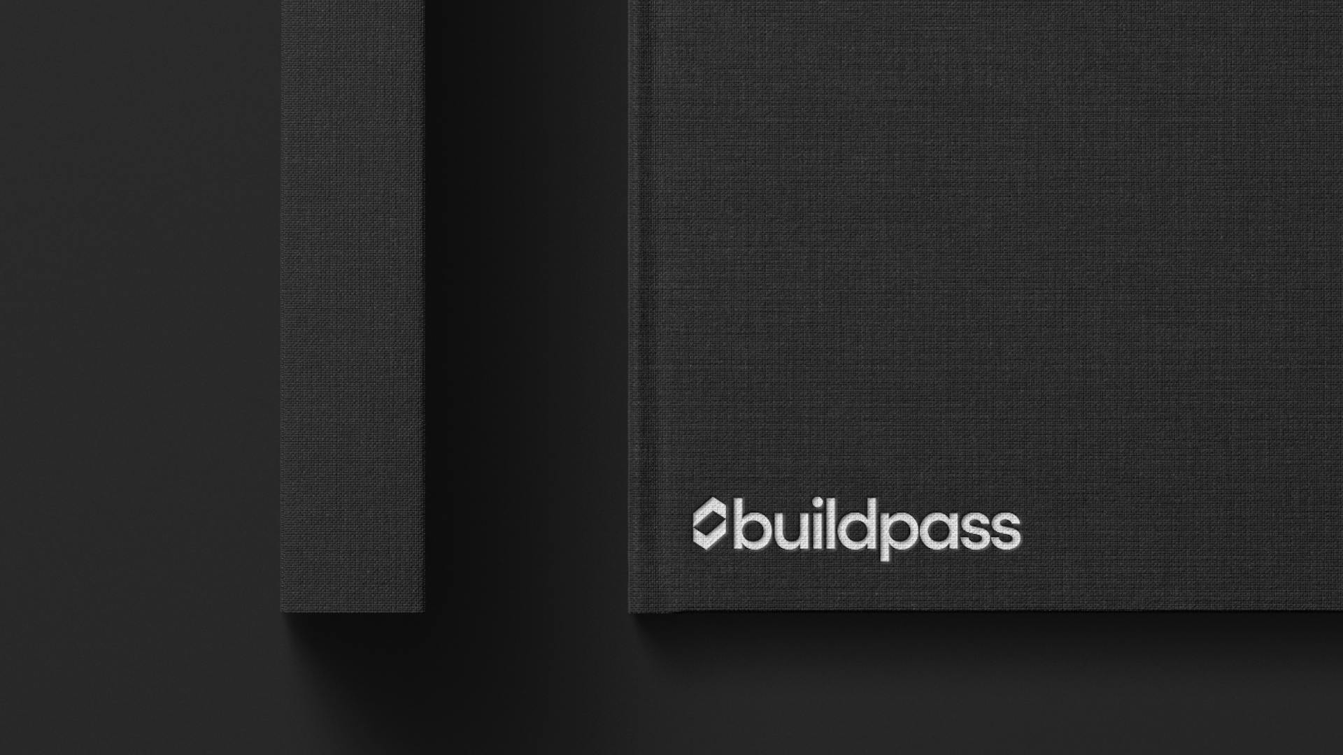
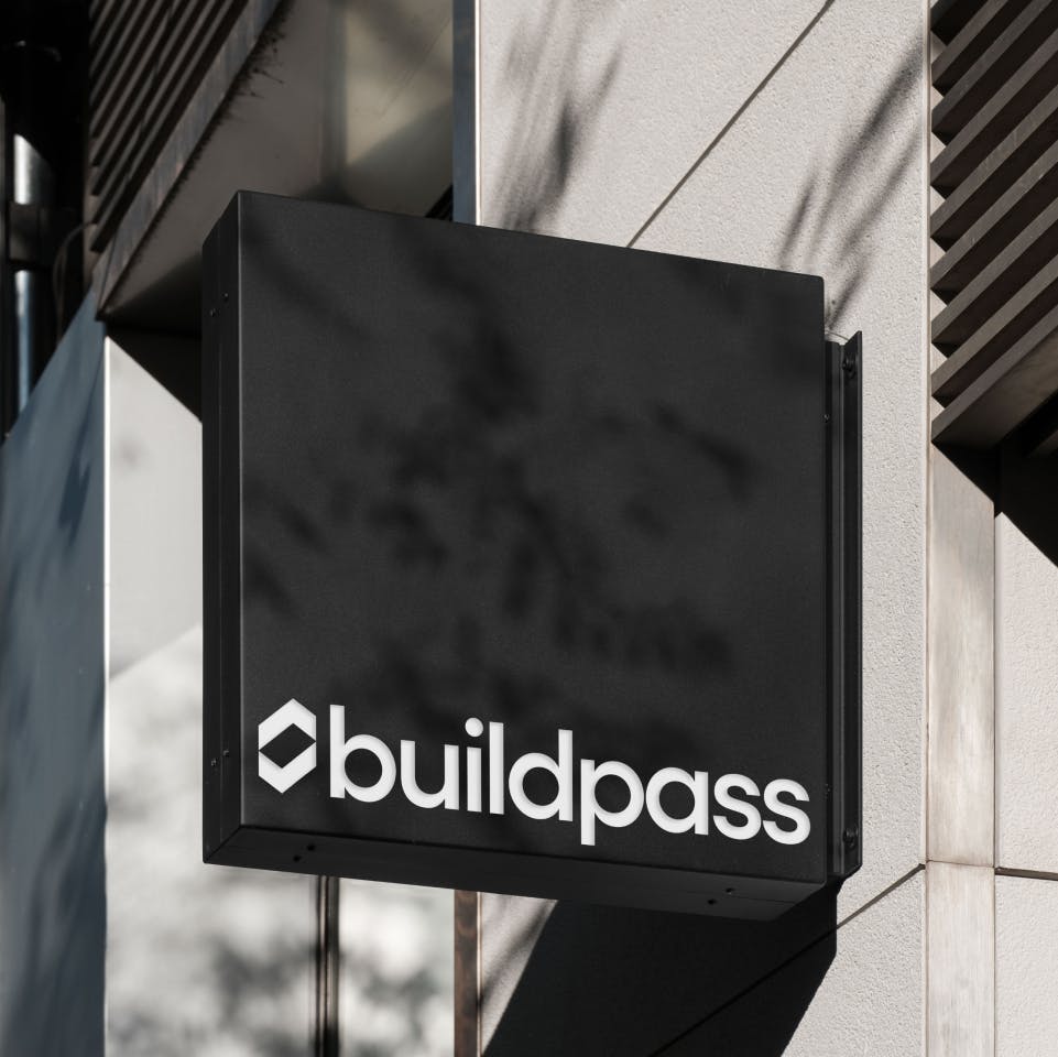
What began as a symbol of safety and compliance in the construction world needed to become a statement of expansive project management and global ambition. The existing identity—a hard hat and tick—no longer reflected Buildpass’s evolution as a business and was a legacy of the past, constraining its image and limiting its potential.
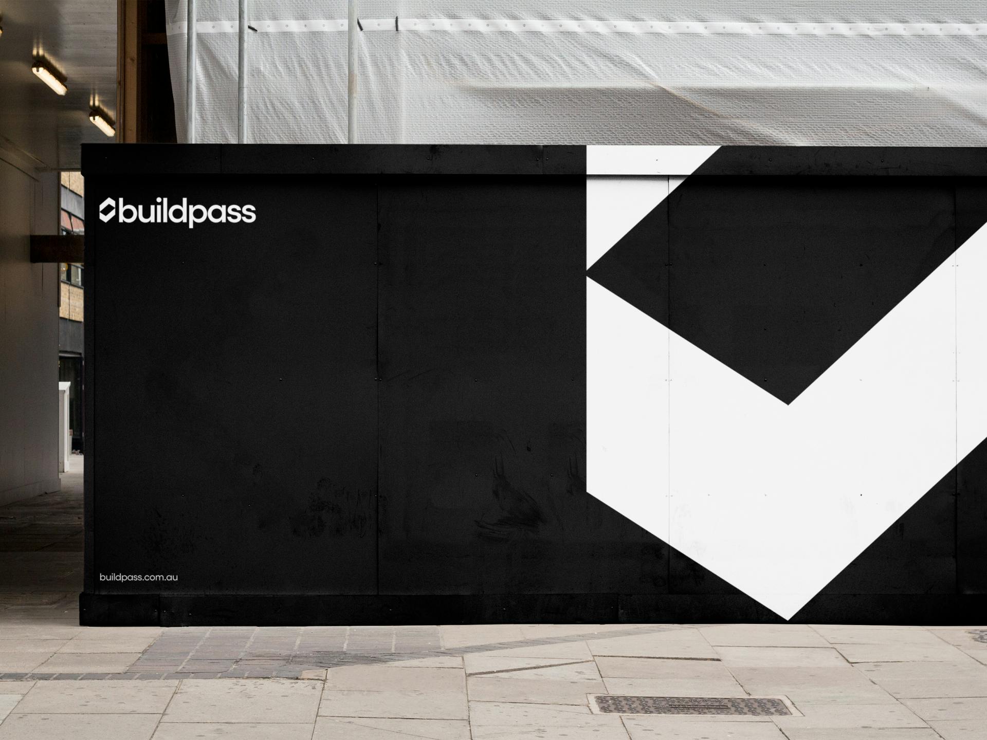
Our process began with a deep exploration of the brand's existing elements, particularly the iconic tick symbol. The focus was to retain this recognisable feature but with new meaning and flexibility. We mirrored the tick device to create a space or room, symbolising the broader scope of services BuildPass now offers. This refreshed tick became a critical visual device capable of being scaled, rotated, and used as a container, adding versatility to the brand's visual language.
The design team developed a cohesive visual language integrating construction and software elements, affirming the brand’s reflection of its dual roots. The new identity balances showcasing the platform with highlighting customer projects, emphasising the practical outcomes BuildPass facilitates. A primarily black-and-white colour palette, complemented by secondary and accent colours, establishes a modern, professional tone. The sans serif and monospaced typefaces echo clarity and precision, reinforcing BuildPass’s commitment to functionality and accessibility.
From start to finish, our focus was on creating a flexible, future-proof system built to adapt as Buildpass grows. The identity is a symbol of a brand ready to lead with sophistication and adaptability. It politely nods to BuildPass's legacy while assertively clearing the way for an exciting future.


