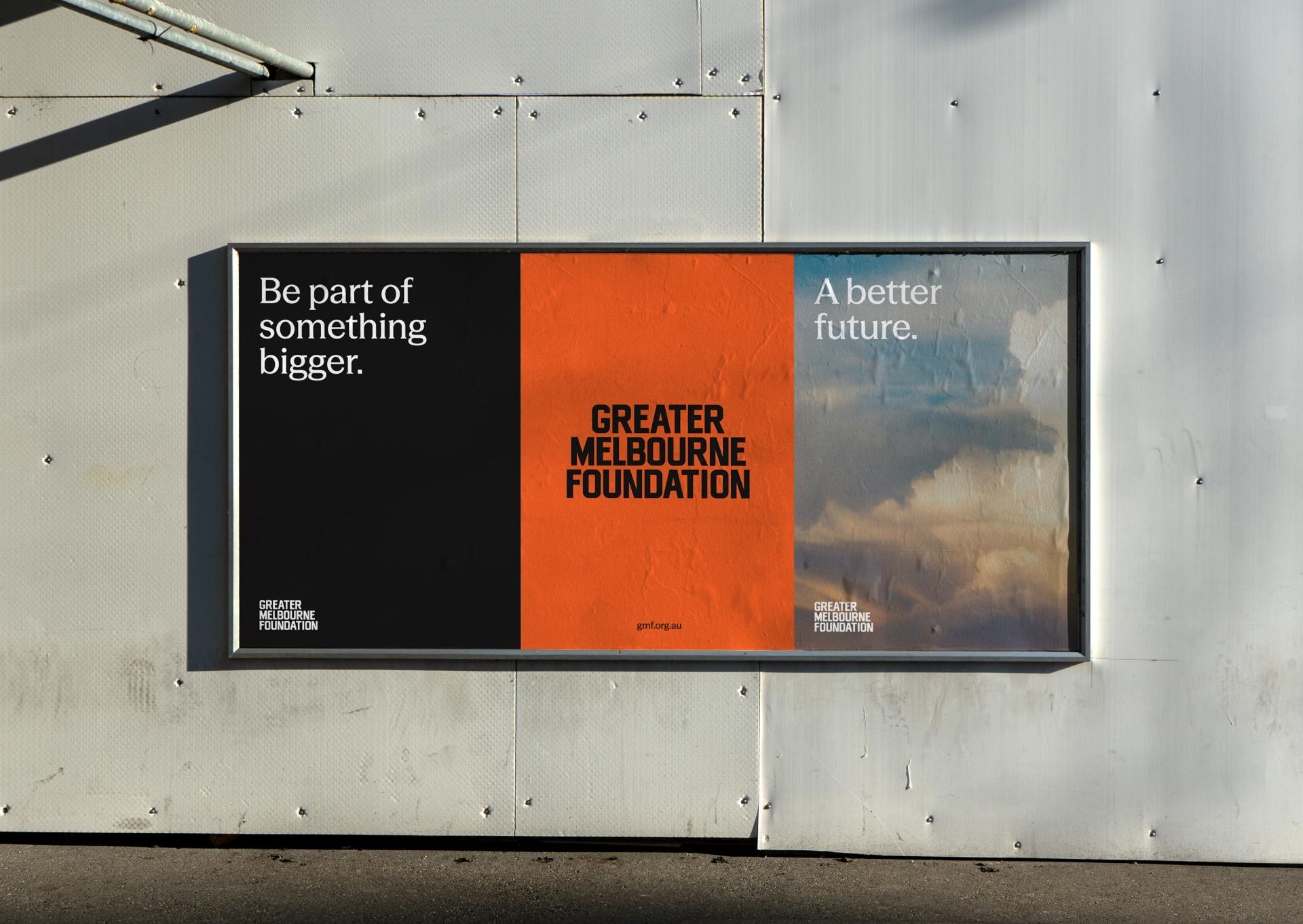
Research made it clear that, to remain relevant and better communicate a growing geographical remit, the organisation needed to change its name from the Lord Mayor’s Charitable Fund to the Greater Melbourne Foundation. It also highlighted a generational shift in philanthropy, with wealth transferring from baby boomers to their children—underscoring the need to reimagine the organisation’s visual and verbal language.
Through consultation and collaboration, we gained a deeper understanding of the community foundation and its audiences and developed the strategic narrative “Together, our impact is greater.” The language resonated across all audiences—including supporters, grant recipients, and staff—capturing the organisation’s simple and genuine intent.
Through the exploration of multiple visual territories, we found inspiration in a handmade banner from the 1925 Hospital Appeal Rally—the moment that marked the organisation’s very beginning. Its distinctive letterforms and striking orange colour became a springboard to tap into the organisation’s rich history, celebrate the contribution of its people, and develop a new visual language that feels contemporary and bold, presented with clarity and confidence.
We created a custom typeface and developed a visual language that brings together humanist typography, a restrained colour palette, and clear recommendations for layout, animation, and photography.
Our strategic communications work took the form of a simple, practical framework, supported by foundational coaching and social media guidance.
We’re proud to be part of this pivotal moment in the organisation’s history, and to be working alongside people who deeply care about the future of Melbourne—championing a fairer city for all.


